Every Image Is WebP and the Page Weight Did Not Move: Format Saved 38%, Pixels Saved 93%
Updated September 2026
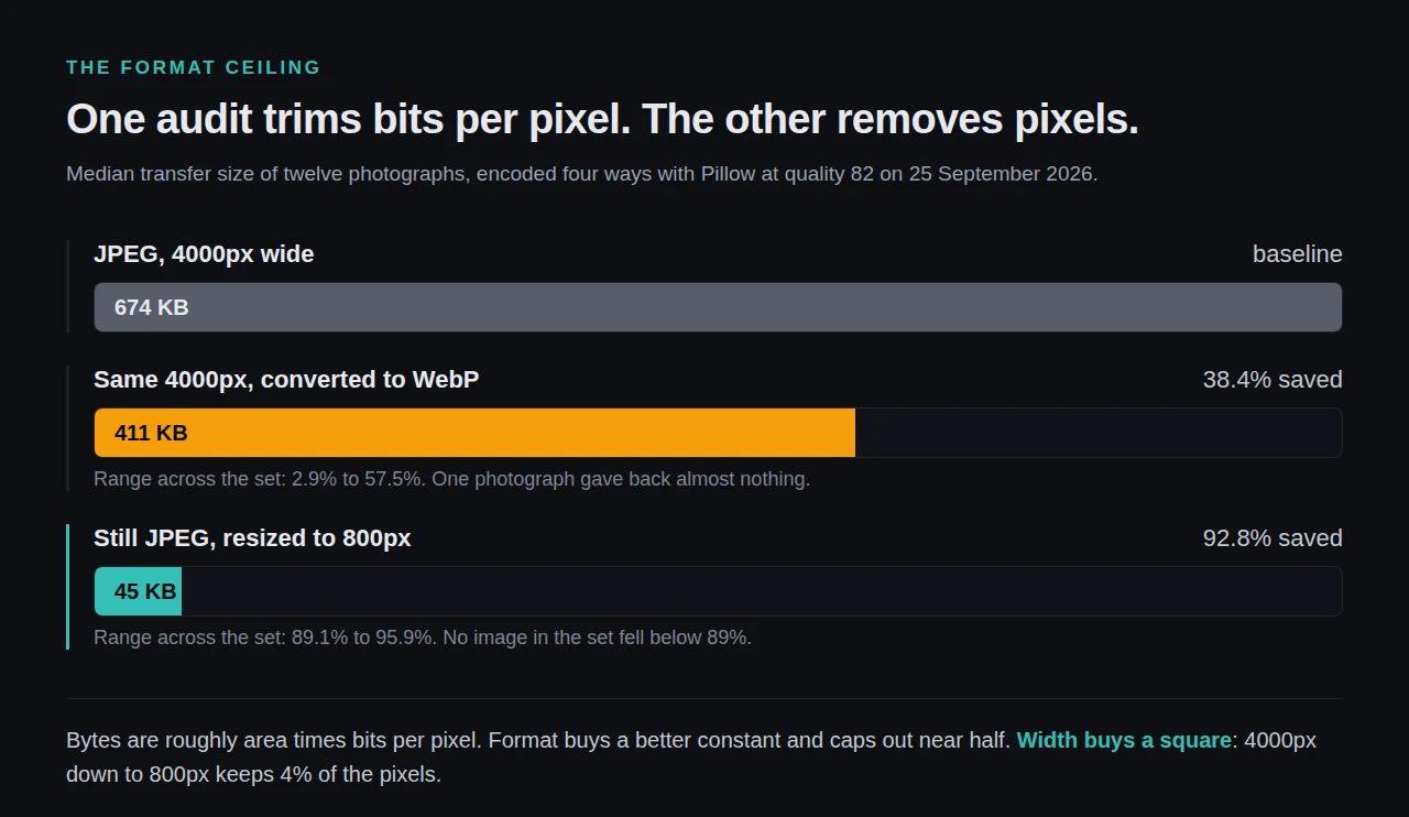
Twelve photographs converted to WebP at their original 4000px width on 25 September 2026 lost a median of 38.4% of their bytes. The same twelve, left as JPEG and simply resized to 800px, lost 92.8%. Both come from one run of Pillow at quality 82.
That gap is the whole answer to a page that is fully WebP and still weighs six megabytes. A format change is a multiplier on bits per pixel. A dimension change is a multiplier on the number of pixels, and pixel count is an area, so it moves with the square.
Quick Summary
| If you want… | Do this | Why |
|---|---|---|
| To know whether this is your problem | Read the “Properly size images” row in PageSpeed, not the format row | Lighthouse lists an image there only when the delivered file is at least 4KiB larger than the rendered one |
| The biggest single reduction | Serve each image at its rendered width times the device pixel ratio | Halving a width quarters the bytes, and no format swap comes close |
To know why srcset did not rescue you | Read the sizes attribute in your page source | Core derives it from the file’s own width, not from the slot it lands in |
| One number for the whole site | Run the free xSpeed Scan and read the page-weight line | It measures what was transferred, not what was configured |
Confirm It First, Because Two Different Audits Look Alike
Per Chrome’s Lighthouse documentation for that audit, the tool “compares the size of the rendered image against the size of the actual image”, the rendered size “also accounts for device pixel ratio”, and an image is listed only when the rendered size is at least 4KiB smaller than the actual size. According to that rule, an image already in WebP can still fill the audit, which is exactly the symptom in the title.
Check one image by hand first. Open DevTools, hover the image in the Elements panel, and compare the two figures in the tooltip: intrinsic size is the file, rendered size is the box. If intrinsic reports 2560 and rendered reports 420, you are shipping roughly 37 times more pixels than the layout consumes.
The Format Ceiling, Measured on Twelve Real Photographs
We fetched twelve photographs at 4000x2250 from picsum.photos on 25 September 2026 and encoded each one four ways with Pillow at quality 82. 800px is what a 400px column needs on a 2x display.
| Encoding | Median size | Median saving | Range across the set |
|---|---|---|---|
| JPEG, 4000px (baseline) | 674 KB | — | 174 KB to 1,875 KB |
| WebP, 4000px | 411 KB | 38.4% | 2.9% to 57.5% saved |
| JPEG, 800px | 45 KB | 92.8% | 89.1% to 95.9% saved |
| WebP, 800px | 31 KB | 94.8% | 92.2% to 97.8% saved |
Two things there decide the order you work in. The format column has a ceiling near 57% and a floor near nothing: one photograph in the set gave back 2.9% when converted, which is indistinguishable from having done no work. The dimension column never dropped below 89%, on any image in the set, and it did it while staying JPEG.
The arithmetic is not subtle. Bytes are roughly area times bits per pixel. Format buys a better constant. Width buys a square. Going from 4000px to 800px keeps 4% of the pixels, and no encoder recovers a 25x difference in what it was asked to store.
One Line in WordPress Core Picks the Wrong File for You
wp_calculate_image_sizes() builds the sizes attribute like this, verbatim from the function reference:
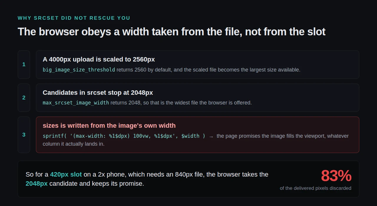
$sizes = sprintf( '(max-width: %1$dpx) 100vw, %1$dpx', $width );$width there is the image’s own width, not the width of the slot on your page. A 2560px upload therefore announces that below a 2560px viewport it occupies 100% of the viewport. In a 700px content column with a sidebar that statement is wrong by a factor of three or four, and the browser believes it, because sizes is a promise the document makes and nothing checks it before layout.
Two core defaults set the outer bounds. big_image_size_threshold returns 2560 pixels, above which, its reference states, an original “will be scaled down”. max_srcset_image_width returns 2048, the widest candidate core puts in a srcset.
Three routes bypass the chain altogether, and they are where the heaviest pages live: CSS background images, which carry no srcset at all; images a page builder writes with a hard-coded src; and images hotlinked from another domain, whose dimensions WordPress never resolved. Our own 1.2.0 release notes that remote images now “get their real dimensions resolved, so lazy loading and the preloader no longer skip them”.
Running This Across a Few Thousand Images
One page is a DevTools job. A media library with 4,000 attachments is not, and the honest answer is that a caching plugin does not fix page weight on its own. Our wp xspeed optimize command is written to say so: it reports “what it could not reach at all (page weight, hotlinked images, DOM size) rather than claiming a win it did not make”.
What tooling does reach is the delivery layer. xSpeed Cache is ours, built by WPDeveloper. On the free tier it lazy-loads images, resolves their dimensions so the hero is not deferred, and serves media through a CDN; the features list and Free vs Pro mark which side of the line each item sits on.
Run the free xSpeed Scan on your own site: xspeedcache.com/scan/ reads transferred page weight rather than settings, so it catches the images no dashboard knows about. Across a fleet, xSpeed Hub runs that same scan on every connected site and the scan MCP documentation covers driving it from an agent. None of the resizing work here needs it.
Common Mistakes People Make Here
- Converting first and measuring second. Convert a 4000px file and you own a smaller 4000px file. The median gain measured above was 38.4%, and one image gave 2.9%.
- Fixing images while the real ceiling is elsewhere. Caching did not fix 93% of slow sites either, and LCP has four parts of which bytes is one.
Frequently Asked Questions
I converted every image to WebP and my PageSpeed score did not move. Did the conversion fail?
Probably not. Check whether “Properly size images” is still listed. If it is, the conversion worked and the dimensions are the remaining cost, which was the larger of the two by roughly two and a half times in the measurements above.
My images all have srcset. Why is the browser still downloading the largest one?
Read the sizes attribute next to it. If it says 100vw at a viewport wider than your content column, the browser is correctly obeying a wrong instruction. Override it with the wp_calculate_image_sizes filter, or set sizes explicitly in the template.
I set a max width in CSS and nothing changed. Is that not enough?
CSS changes the rendered box, not the transferred file. The browser downloads from src and srcset, then scales the result down for painting. The bytes already crossed the network.
Should I use AVIF instead of WebP to get further?
AVIF usually beats WebP on photographs, but it is still a bits-per-pixel change and sits under the same ceiling. Resize first, pick a format second, then compare the two numbers on your own images.
My page builder inserts images and none of them have srcset. What now?
That is the hard-coded src route. Reinsert through the media library where the builder allows it, or register the exact sizes your layout uses and set the builder to emit them. An image CDN that resizes on request is the other fix, and the xSpeed Cache CDN is one of several ways to front one.
Your Next Hour, in Order
| Goal | Step | Effort |
|---|---|---|
| Find out whether this is you | Read the “Properly size images” rows in a PageSpeed run | 5 minutes |
| Stop the recurrence | Register the sizes your layout uses, then set sizes from the slot | 1 hour |
What to do this week: open a PageSpeed report and read the dimensions audit before the format audit. Measure one hero image’s intrinsic size against its rendered size, resize that one file, and re-run. On a store, where a gallery multiplies each decision by the variant count, the WooCommerce guidance covers that case. If you would rather have page weight tracked than checked by hand, xSpeed Cache is free on the WordPress plugin directory, and Pro starts at $29 a year at the founding price with a 14-day money-back guarantee on pricing.